Posts

Showing posts from August, 2014

Mushishi Zoku Shou: Path of Thorns

Image
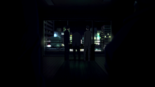
Darkness and isolation were the major themes of “Path of Thorns.” Simple usage of different shades of black background, single subject composition (the hut), and slow tilt movement communicated these themes powerfully. While shots of darkness dominated this double episode, the more interesting part is the use of small light, specifically candle light. If the shots were constantly dark, it could start feeling monotonic and lose that haunting effect. The shots of candle light provide contrast that help exaggerate the darkness. Losing that small amount of light is more haunting than constant darkness.

Hanamonogatari

Image
The Monogatari series offers a variety of abstract composition and Hanamonogatari was no exception. The series’ uses of compositional elements are very much open to interpretation and at times can be a bit enigmatic. The unorthodox style is part of the appeal to many but can be polarizing to a few. Anyway, let’s begin with these shots: Spinning Objects The beginning parts of this arc gave us repeated shots of rotating things, such as paper windmills, an umbrella and spintops. They are all colored red, a striking color that strongly draws the viewers’ attention to these objects. A major theme of Hanamonogatari’s story is time and the way it can be used as an escape and how it can pass a person by. These objects seem to symbolize time as they rotate just like the hands of a clock or the earth on its axis.

Space Dandy S2 Episode 8

Image
Almost right from the very beginning the show uses canted framing . This type of unleveled framing is often used in action heavy scenes to create a hectic pace. However, it can also be used to create some visually unnerving shots, which was the case in the beginning of this episode. These canted shots immediately induce a sense of eeriness that is often associated with the world of the dead. ________________________________________________________________________ Cold-Warm Contrast The above is probably the most striking cold-warm contrast shot in this episode. Notice how most of the shot, the background and mid-ground, have a blue (cold) hue to it while the foreground on the left side is mostly red (warm). This creates a stark contrast that strongly draws the viewers’ attention to the only warm part of the image, which of course makes the sad looking lady clown with a cat protruding off her chest look even creepier.

Zankyou no Terror Episode 7

Image
The Rule of Thirds  is a general guideline to help with balancing a composition and avoiding splitting a picture/shot in half. This episode broke this rule with numerous centered shots to provide more tension and impact to the more significant moments. Perhaps it was bit overdone but I think most of these shots at least had a set-up and reasoning behind breaking the rule. From left to right: This was the scene where Shibazaki and his colleagues were thinking about the possibility of the authorities orchestrating the bomb threat. This last shot is Shibazaki basically confirming it. A winning shot of Nine after beating Five in chess. A centered shot of Five that expresses her commanding and controlling presence. This also nicely sets up the scene where she loses some control after being outwitted by Nine. POV shot of Nine pointing the gun at Five. I have to admit this was a bit cheesy. Probably the best rule-of-thirds breaking shot of this episode. The fir

Haikyuu!! Episode 20

Image
The pressure of the intense game against Aoba is beginning to become overwhelming. The one that has been most affected by this is Kageyama, who has put the entire burden on himself to win the game. This unnerving pressure was communicated to the audience through composition. Shots of Aoba players in the background were more prevalent with Kageyama than any other character. By having Aoba players in Kageyama’s background numerous times a consistent imagery of “one vs. team” gets established and provides a visual of his self imposed burden to win singlehandedly. This was also an effective way to evoke from the audience the tense feeling that Kageyama was experiencing.

Zankyou no Terror Episode 6

Image
There were numerous amounts of extreme close-up shots in this episode, specifically the eyes. The reason for this is perhaps to underline a turning point that occurred for a few characters in this episode. Those turning points would be, Shibazaki forming a camaraderie, Nine showing a sign of acceptance towards Lisa and the start of the Five vs. Nine rivalry . Extreme close-up shots of the eyes just have a naturally gravitating effect that is very useful for emotionally involving the audience into significant character changes and events. Almost right from the beginning this episode tries to have the audience invests themselves into Nine with an extreme close-up showing the weariness and emotional drain in his eye. A disapproving and suspecting look from Shibazaki. In his mind he’s already acting as a lone wolf. This sets up the scene where he discovers that he’s not alone in this fight.

Haikyuu!! Episode 19

Image
The last scene in this episode, which was the Kageyama setter dump, made great use of foreground framing to put focus on the character on screen and to also create continuity. The characters on play were used for foreground framing; by doing this the viewers become aware of the other parts of the play developing despite not being the focus of the shot. This viewer awareness was essential in creating a sense of continuity, which was very important for the misdirection the scene was going for. The first image (top-left) is the beginning of the play, with Hinata acting as the first decoy. Kageyama is also on screen, this helps with the continuity in the next shot (top-right) where his body is used for foreground framing . The focus of this shot is the Aoba player witnessing the play develop, which is in the third shot (bottom-left). In this shot Tanaka is the second decoy, again Kageyama is being used to frame the shot for continuity purposes. The fourth image continues T

Zankyou no Terror Episode 5

Image
This episode introduces us to Five. The most noticeable thing about the images below is that her face is always not in full view. This is a straightforward way of giving a character an air of mystery but her striking first impression comes from the lighting. You’ll notice there’s always light on her. In the first image it’s the summer sun, the sunlight through the window in the second and the lamp in the third. This is opposed to most of the characters who spend a good amount of their screentime in the shadow. This contrast gives her an aura of brazenness and boldness. A few more things that make these shots attention grabbers are the use of bloom and shallow depth of field. The bloom in the first two shots highlights the character. The shallow depth of field in the first and third shot directs the viewers’ eyes to her face. This was especially effective in the third shot where the viewers’ attention is drawn to that daring look in her eye.

Space Dandy S2 Episode 5

Image
This episode was exceptional at immediately immersing the viewers to a new world by making the main character inconspicuous. By immersing the viewers in the initial moments, they get absorbed into the journey even before the focus shifts to Dandy. In this shot you really don’t notice Dandy right away. He’s a tiny figure at the bottom right, covered by the shadow and his brown color palette blending with the ground. The audience’s eyes are immediately attracted to the environment, specifically the cacti.

Zankyou no Terror Episode 4

Image
The obvious eye-catcher in this episode was the exquisite motorcycle scene. The best parts of the scene were the use of camera movement to seamlessly transition to a cut. In this cut the camera pushes in until the tire covers the entire screen. This acts sort of like a fade to black. The camera then zooms out to show the viewers a side view of the motorcycle. This sequence, due to good camera use has a feel of a very smooth match on action cut.