Posts

Showing posts from September, 2014

Space Dandy S2 Episode 13

Image
This final episode sure was a visual feast. Not much in way of thoughtful composition but this was a fast paced and action-centric episode, appropriately much of the focus was on delivering superb animation and exciting sequences. There was plenty of dynamic camera work, mostly composed of follow/tracking shots. The most impressive parts were the almost unnoticeable cuts that made the some of the action scenes looked seamless.

Zankyou no Terror Episode 11

Image
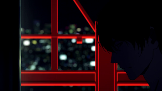
While the finale didn’t meet my expectation of gripping composition and more dynamic camera work, I still think it delivered some interesting shots. It’s also hard to be disappointed when the finale also delivered a strong cohesive visual storytelling from the countdown to the aftermath. The red beams in the background serve two purposes. First, they give the audience an idea of his location (Tokyo Tower), which explains Nine’s high vantage point. Second, red is a striking color further intensified by the muted foreground. This combined with the movement of the elevator creates a dynamic shot that expresses an imminent dangerous act that builds anticipation. This shot is far more interesting when seen as a contrast to this shot (cool vs. warm) and part of the visual narrative. ________________________________________________________________________ The camera behind the wall, the shallow focus and a very slight shaky cam give a feeling of a first person view of Lisa and

Space Dandy S2 Episode 12

Image
This episode had a plethora of camera movements and editing techniques. In terms of editing there were dissolves, wipes, split screens, split screen wipes and match cuts. The camera movements were composed of pans, whip pans, tilts, shaky cam, erratic zooms and parallax effect . The camera work lacked movement in the z-axis but the variety mixed with the snappy editing gave the episode a dynamic look. For the most part the stylish camera work and editing worked well in conjunction and maintained continuity. Although, there were actually too much going on that it made it hard to take in the scenes and pin point anything to talk about. Also, some of the dissolves were way too slow and visually distracting. Some of the split screens resulted in sloppy framing and the point of interest being partially obstructed. Despite some faults, all in all the direction in this episode was interesting. The most interesting part was the clever use of formulaic sequence of shots for the testimon

Haikyuu!! Episode 25

The quietness from the ending of Episode 24 continues with the intro to this season finale. Although not completely silent since there’s a really soft music that aids the scene, there’s calmness to it that resonate strongly. The show makes exceptional use of silence to contrast the characters’ thoughts with the normalcy of school life. The intro starts with a brief flashback to show the intensity and excitement of competition. This is to establish where the characters’ minds are at, which is volleyball. The scene conveys the difficulty of letting go of that strong experience (especially after a painful loss) and settling back to the routine of school life. This feeling is further reinforced with the good usage of panning shots. The camera slowly pans not just for dramatic effect but to show a full view of the characters in their classroom and how their class is the farthest thing from their minds. I also liked that in a couple of shots panning was used to create

Tokyo Ghoul Episode 12

Image
This finale heavily used white and red for compositional purposes. White is often associated with purity and good. Red is an intense and eye grabbing color that’s attached to strong emotions, whether they’re positive (love, passion, excitement) or negative (hate, pain, violence). The latter being the representative meaning of red in this episode. The centered wide shot of Kaneki and Rize gives a strong visual of what each character represents. The white flowers are an imagery of what Kaneki aspires to be, which is kind, pure and caring just like his mother. Rize is the ghoul side of Kaneki that infringes upon this vision of himself and tries to awake his real emotions. This is reinforced by the white flowers turning red within her vicinity. In Kaneki’s memory sequence about his mother the white and red flower imagery continues to hold significance. In the first shot, the white flowers are symbolic of a happy moment that exemplifies his mother’s kindness. In the second on

Haikyuu!! Episode 24

Image
This episode did a great job of capturing the intense emotions of competition and how sudden that can change to an emotional drop-off after a defeat. Kageyama and Hinata’s conversation with Takeda were especially poignant. It’s a quiet scene that lets the sincerity of the moment sink into the audience. The above clip is a wide shot of the Takeda conversation. The wide shot gives us a look at the contrasting body language of the characters. Kageyama and Hinata are slumping on the ground sulking while Takeda is standing straight up with a look of poise. It’s an image of difference in maturity that communicates Takeda’s role as a mentor and advisor. Also, notice the large amount of negative space between the characters and above them. This plays into quietness of the scene and its contemplative nature. This wide shot lingers a bit longer than usual. The longer take allows the audience to absorb the brief pauses where Kageyama and Hinata are lost for words. This is

Space Dandy S2 Episode 11

Image
I really liked the moodiness of the cold intro to this episode and how it uses color and scale to emphasize certain things. I think the most noticeable thing about this intro was everything is desaturated except for the neon lights outside and the glass of drink. Desaturation combined with strong shadows has a gloomy and somber effect. The use of a few colorful elements for contrast makes this mood even more potent. In the three images above there’s a slight shallow focus. The glass is slightly out of focus while Dandy is in focus. This helps maintain Dandy as the primary subject of the shot even though the more colorful glass of drink pops more visually. You’ll notice in the second image that the camera moved in closer to make the glass of drink appear larger. In this intro we never saw the woman Dandy was talking to but by emphasizing the glass of drink we start attaching her voice to it and it becomes her analogue. In the third image (from the same shot as the secon

Zankyou no Terror Episode 9

Image
The thought of children being harmed would make anyone feel uneasy. This was exactly the feeling the Aoki interview scene evokes as he reveals the harmful effects of the experiments on the orphans. To create this sense of unnerving tension, the scene uses frame within frame shots and some really odd and unconventional framing to isolate Aoki. This visual isolation was a way to contrast his extremely skewed and inhumane moral values with the more balanced morals of Shibazaki and Hamura. The first three images break the Rule of Thirds by having Aoki way off to the side of the frame. The unbalanced composition fits the sense of unease the scene was going for. There’s also a sense of isolation and soullessness by having all that empty space in the frame. What makes these shots even more effective is how they contrast with the more balanced framing of Shibazaki . The last image doesn’t really break the rule but what makes it odd is the lack of nose room. Again, the unbala