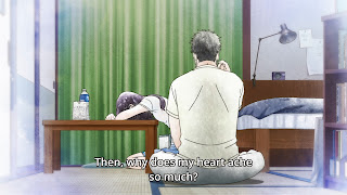
Shigatsu wa Kimi no Uso (Your Lie in April) Episode 21
This was quite an emotionally heavy episode. The moments
that emotionally stood out were the Kousei-Hiroko and the rooftop scenes but
what really caught my attention was the hospital room scene between Kousei and
Kaori. This scene effectively used framing and other compositional elements to
create a distant mood that then shifts to one that’s more intimate.
 |
 |
The scene starts off with an awkward and detached mood.
Kousei avoids conversation and eye contact to distance himself from the pain of
seeing the deteriorating health of Kaori. The two “two shots” above reflect
this feeling of detachment. The three-quarter angle shot (first image) and the
wide shot created distance between the two characters that conveyed a feeling
of disconnect. This feeling of disconnect was further reinforced with the use
surface division and dividing lines that visually separated the characters. The
three-quarter shot staged Kousei against a white surface while Kaori was
against a brown one. The wide shot used the pink hospital curtain as a strong divider.
 |
 |
The single shots (primarily medium close-ups) used off
center framing and had the characters looking completely away from the camera to
maintain the mood of detachment. While off center framing (rule of thirds) is
quite conventional, in this instance it functioned to reinforce the detached
mood by creating distance between successive single shots.
By having the characters completely look away from the
camera it purposely made this part of the scene feel impersonal both between
the characters and the audience. Additionally, the eyeline strongly angled away
from camera combined with the off center framing added strong visual weight to
the characters’ eyeline. Eyeline visual weight is usually helpful in connecting
two subjects but since Kousei was looking away from Kaori it functioned more as
a separator.
When Kaori amusingly got tired of Kousei’s gloominess and threw
a stuff toy at him, the scene’s mood changed. Kousei woke up from his gloomy
trance and the interaction between the two became more endearing and personal.
The change in mood was reflected by the change in framing and composition. As
you might notice in the “two shot” above there’s less distance in frame (not physically)
between the two characters. The more direct over the shoulder shot also
eliminated the surface division and dividing line that were previously separating
the characters.
 |
 |
After the mood change the single shots were more centered
and the characters were only slightly looking away from the camera. The
centered framing decreased the distance between the single shots and brought
more focus to the characters. The eyeline slightly angled away from camera
combined with eyeline match cuts made this part of the scene more personal
between the characters and more engaging to the audience.


Comments
Post a Comment