Zankyou no Terror Episode 2
So far Zankyou no Terror has heavily used low-key lighting,
which creates a high contrast between the light and shadow.
This medium close-up of Mishima the bloom highlights her feeling of apprehension and curiosity as she looks back at the empty desk of one of her terrorist classmates.
This shot uses canted framing to create diagonal lines with the book shelves. Also, this shot being a one point perspective draws the audience’s attention to the center and adding a tilt to it really adds to the disorientation.
 |  |
 |  |
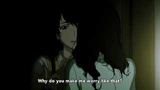
In these shots the low key lighting was predominantly used
on the characters to give a dark dramatic effect. In Mishima’s case it’s done
to emphasize her dysfunctional and emotionally unhealthy relationship with her
mother. With Nine and Twelve it was to add an air of mystery and suspense as
they plan out another terrorist attack. The Shibasaki shot can be seen as straightforward
imagery of a detective in the shadows.
 |  |
Low key lighting was also used for background shots to
create a tense mood and a heavy and distressing atmosphere. In the first shot
Twelve and Nine are part of the background and again visually portrayed as
shadowy figures.
_________________________________________________________________
The show also uses bloom lighting a few times which helps
prevent monotony. It was also done mostly as a clever way of highlighting the
characters.
This medium close-up of Mishima the bloom highlights her feeling of apprehension and curiosity as she looks back at the empty desk of one of her terrorist classmates.
The bloom here highlights Nine’s next act of terrorism.
A medium close-up of Shibasaki with the bloom accentuating
his detective work that led to the location of the attack.
________________________________________________________________________
During the Oedipus Rex exposition, diagonal lines were used
to disorient the audience which creates an unnerving feeling that can be
associated with such a twisted and tragic tale.
 |  |
In these two images notice that they're shot in a way that frames
the table, chair, white board and the lines on the walls diagonally.
This shot uses canted framing to create diagonal lines with the book shelves. Also, this shot being a one point perspective draws the audience’s attention to the center and adding a tilt to it really adds to the disorientation.


Great read thank you.
ReplyDelete