Posts

After the Rain – Episode 7
Image
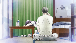
Distinctly manipulated lighting and shadows, fog and smoke effects, rain, stylized use of contrast and desaturation, and a myriad of image processing – these are often used to create visual textures that can capture a mood, an atmosphere and a certain emotional tone. Visual textures definitely tell a story but often a singular one strongly befitting a scene or even an entire movie. What stood out in this episode of After the Rain is the use of visual textures as a narrative device in an almost shot by shot basis. Various visual textures were used to accentuate the characters’ emotions and to mirror the dialogue. After a tense interaction with Kondo in which he said (to Tachibana), “You know nothing about me,” the characters then faced their emotions in Kondo’s apartment. The scene started off neutral in terms of lighting, color and texture. When the two started to express their feelings more, the visual texture changed to reflect the emotional shift. The above screenshots sh

Koe no Katachi (A Silent Voice)

Both in the beginning and towards the end of Koe no Katachi there’s a fundamental scene where Ishida walks in the school hallway in anxiety while avoiding eye contact with his fellow students. The key difference between the two scenes is that the first one was done in a subjective point-of-view while the last one in an objective point-of-view. The difference in POV was to visually accentuate the contrast in narrative between the beginning and the end. Subjective POVs are usually shot in first person perspective and this is exactly how a large portion of the first “hallway scene” was shot. In this POV the audience sees the world from the character’s eyes, a far more visually and emotionally engaging experience. The viewer is in Ishida’s shoes as he walks through hallway, nervously looking down at the ground and avoiding the faces of other students. The camera shakes and moves unevenly. This motion of the camera not only emulates Ishida’s movement but also highlights his discomfor

Hibike! Euphonium S2 - Episode 9

Image
There was a part of the episode where Asuka opened up about her mother and described her as crazy, possessive and hysterical. These are words with strong negative connotations and yet Asuka uttered them in a nonchalant and cold manner. She even rationalized that she didn’t hate her, as if putting on a façade. Fittingly her dialogue was shot as a direct overhead shot. This type of shot tends to be flat and minimizes perspective lines. This visual, depending on context, can feel cold, sterile and unengaging. The coldness and sterility of this visual captured her tone and demeanor. The unengaging flatness accentuated the sense of disconnect presented by her façade. Overhead shot Kumiko saw through this façade and didn’t mince words. She immediately insinuated that Asuka actually hates her mother despite her calm and carefree demeanor. The façade was broken as reflected by the drastic transition from the unengaging overhead shot to the more emotionally engaging close-up and extre

Hibike! Euphonium S2 - Episode 3

Image
The beginning of the discussion scene between Kumiko and Asuka purposely broke the 180 degree rule in order to build tension. The 180 degree rule is designed to maintain the camera on one side of the line of action so that the subjects stay on their side of the frame consistently. This is done for visual continuity, which makes it easier for the audience to follow the scene. The rule is broken when the camera jumps the line and the subjects suddenly switch sides on the next frame. There are times the rule is broken for either practical or narrative purposes. The scene between Kumiko and Asuka broke it for the latter reason. The characters switching sides multiple times created a subtly disorienting and jarring visual that enhanced the tension of the scene. This disorienting visual also reflected Kumiko’s feeling of unease and nervousness throughout the entire exchange. 180 degree rule broken: Asuka on the left side in the first then switches to the right in the next shot. Th

The Case of Hana & Alice

When the camera moves it’s always good to have a reason behind it whether it’s practical or narrative driven. Camera movement with perspective changes is even more dynamic in traditional animation since it’s a lot rarer. This rarity makes the camera move a powerful visual storytelling tool and The Case of Hana & Alice made use of it to a great effect. The Case of Hana & Alice is a story about two teenage girls dealing with significant changes in their lives. The movie conveyed these changes through camera movement and perspective changes. Horizontal tracking shots were utilized as a visual metaphor for the pivotal transitions in the story and the characters’ development. The rare perspective changes in these shots aided in giving more emphasis to the visual metaphor. The first horizontal tracking shot of the movie is Alice and her mother walking to her new school. Transferring to another school comes with the challenges of getting to know new people, getting accustomed

Beautiful Bones -Sakurako's Investigation- Episode 7

Image
During the conversation about Sakurako’s autopsy of her pet cat, there was a sequence of close-up shots that only partially framed the face or didn’t show it at all. This practice is quite common in anime, especially during dramatic moments. I think these are done for an effect. Watching a dramatic exchange without seeing the character’s face is visually odd and uneasy, which is an effect that can add tension to the scene. Another effect of these types of shots is they put more emphasis on the voice acting and body language, which at times might be a more effective emotional stimulant than facial expressions. The aforementioned reasons for these odd and uneasy shots hold true for this sequence in this episode but they also match the mood of the conversation. The visually uncomfortable framing accentuated the naturally unsettling idea of dissecting a pet, an idea that really bothered Shoutarou. There was also a tension between two differing personalities that this odd

Beautiful Bones -Sakurako's Investigation- Episode 6

Image
The major conflict in this episode was the differing beliefs between Yuri and Isozaki about the issue of suicide. After failing to find the woman they assumed to be suicidal, their disagreement came to a head at the river bank. I thought the visual storytelling in this scene was effective at displaying the conflict, understanding and compromise between the two characters. Low Angle High Angle The first set of visual devices was the commonly used high and low angles. What made the high/low angle usage in this scene a bit different than the usual was it switched on the characters. These switches were narratively driven but also done in practical manner which made the switches feel natural. If you rewatch the sequence above it starts with Isozaki at the top of the steps and Yuri at the bottom. From a practical sense in order to account for differing elevations of the characters, a low angle was used on Isozaki and a high one on Yuri. Even after Isozaki came down the