Posts

Showing posts from July, 2014

Zankyou no Terror Episode 3

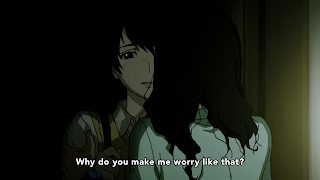
The scene below is a good example of visual storytelling. The use of one point perspective directs the viewers’ gaze to Lisa, which is important for the emotional connection this scene is trying to achieve. With the audience’s attention drawn to the center, they themselves can feel surrounded by the shadows in the hallway; a visual experience that effectively coveys a morose atmosphere. The only light source from the outside not only put more focus on Lisa but also gives off a “light at the end of the tunnel” effect. Lisa walking away from that light expresses her feeling of hopelessness. Also, notice the girls socializing outside. This is a stark contrast to Lisa being alone in the darkness of the hallway and further reinforces the strong sense of isolation present in this scene. There are a couple of cuts to Lisa’s shoes, and each time the camera zooms closer. This visually communicates that she’s still a target of bullying, which is then confirmed as she discovers her locker to...
Haikyuu!! Episode 16

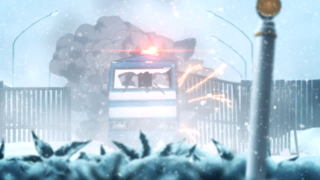
Whip pans can be visually off-putting when used inappropriately due to the abrupt movement and distortion of image. When used well, whip pan is a good way to do dynamic transitions especially in action oriented scenes and that’s what this episode of Haikyuu does. In this sequence two different actions in different places are cut together. By using whip pan to imitate the volleyball’s movement it makes a seamless transition from one action to another, which gives an impression of one cohesive action. This also helps the narrative as it connects two groups of people going through a similar experience of being overmatched but yet still staying resilient.

Zankyou no Terror Episode 2

Image
So far Zankyou no Terror has heavily used low-key lighting, which creates a high contrast between the light and shadow. In these shots the low key lighting was predominantly used on the characters to give a dark dramatic effect. In Mishima’s case it’s done to emphasize her dysfunctional and emotionally unhealthy relationship with her mother. With Nine and Twelve it was to add an air of mystery and suspense as they plan out another terrorist attack. The Shibasaki shot can be seen as straightforward imagery of a detective in the shadows. Low key lighting was also used for background shots to create a tense mood and a heavy and distressing atmosphere. In the first shot Twelve and Nine are part of the background and again visually portrayed as shadowy figures.

Zankyou no Terror Episode 1

Image
The dynamic scenes in this premiere made great use of low level framing to add intensity to the action. The low level of framing puts all the mad scramble right on top of the audience. This makes the movements seem dominating and more hectic which are effective ways to create intense moments.

Ao Haru Ride Episode 1

Image
The first episode uses distance and surface division to convey the mood between the characters. Usually distance and surface division are used to express emotional separation between two characters. The shot above uses them to create a rather charming interaction between the characters. The use of bloom and watercolor texture softens the lines of division and gives the scene a dreamy look. This makes the use of distance as an effective way to express the innocence and awkwardness of young love.

Aldnoah.Zero Episode 1

Image
This episode uses visually striking long shots not just for eye candy but to pique the audience’s curiosity and set up the forthcoming expositions. The two shots below raise the questions about the moon’s destruction and the gigantic ships orbiting the Earth, by doing so the viewers become more attentive and receptive to the details later provided by the exposition. This is a simple but effective usage of visual stimuli to inject interests into expositions.

Tokyo Ghoul Episode 1

Image
This early scene immediately establishes the dark tone of the show with the heavy use of shadows and silhouetted characters. I also liked the used both warm and cold colors to add to the grimness. Red obviously symbolizes violence while purple has that cold hearted intensity to it.